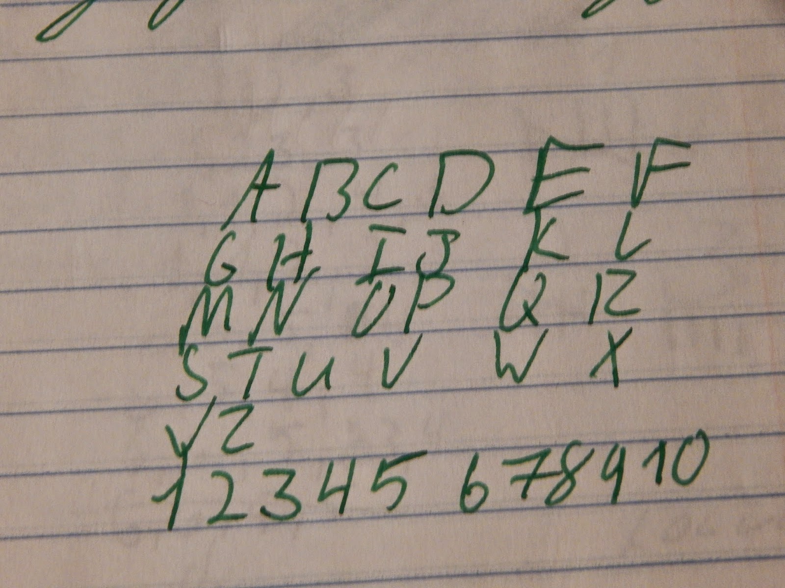
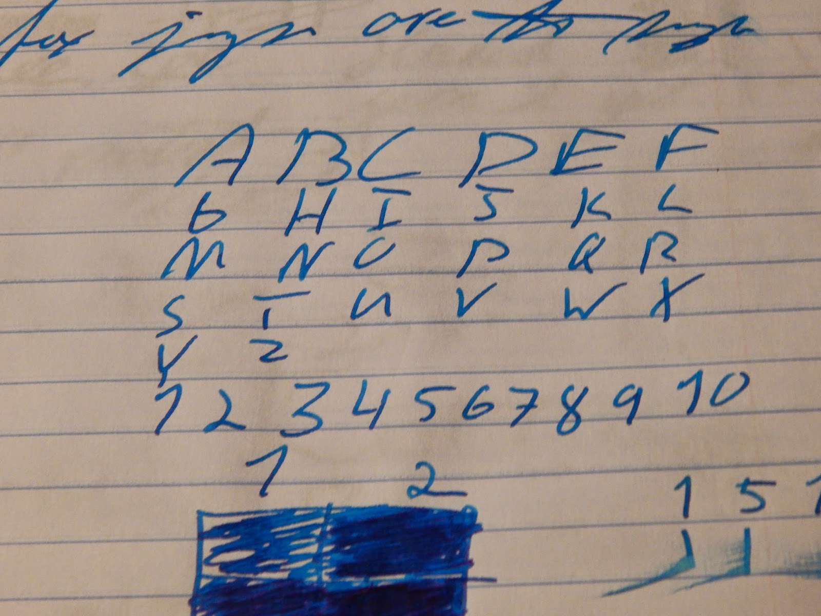
have been looking for a good green ink lately. Montblanc Irish Green, J. Herbin Lierre Sauvage, and a few others look enticing, but it looks like Kaweco also has an ink in the running. Palm Green is a nice summery green color, that I can't get enough of. The ink is not perfect though. I have found that while the ink is not exactly dry, it does not have great flow. Granted I did put in a pen that had some flow issues, but they have never been this bad. Multiple times I had to open up the pen and saturate the feed (that is why the green is darker in some places than others). This ink also is capable of a little dark red, almost black, sheen to it. It was extremely hard to capture, but it can be seen in the swab, and a little in the last picture. Other than slight flow issue, that in the right pen could be solved, this is a lovely green ink. I would say if you are mulling over a few greens to try out that you should definitely throw this one in the mix. Or if you can't decide to pull the trigger on it or not to just go for it, I doubt you'll be disappointed. The ink is a little on the expensive side though, about 46₵ a ml. Now for the pictures.
Sunday, February 15, 2015
Ink-sane Sunday #5 Kaweo Palm Green
DISCLAIMER**** This pen was provided to me by Kaweco, but I was in no way compensated for this review. All views in this review are my own, and are not influenced by anything else.
have been looking for a good green ink lately. Montblanc Irish Green, J. Herbin Lierre Sauvage, and a few others look enticing, but it looks like Kaweco also has an ink in the running. Palm Green is a nice summery green color, that I can't get enough of. The ink is not perfect though. I have found that while the ink is not exactly dry, it does not have great flow. Granted I did put in a pen that had some flow issues, but they have never been this bad. Multiple times I had to open up the pen and saturate the feed (that is why the green is darker in some places than others). This ink also is capable of a little dark red, almost black, sheen to it. It was extremely hard to capture, but it can be seen in the swab, and a little in the last picture. Other than slight flow issue, that in the right pen could be solved, this is a lovely green ink. I would say if you are mulling over a few greens to try out that you should definitely throw this one in the mix. Or if you can't decide to pull the trigger on it or not to just go for it, I doubt you'll be disappointed. The ink is a little on the expensive side though, about 46₵ a ml. Now for the pictures.
Ink-sane Sunday #4 Waterman Inspired Blue (South Seas Blue)
I would have never guessed it in a million years, but I have recently fallen for turquoise inks. The lovely shading, and bright happy color that most of them offer just tick all of my marks. This one is currently my favorite. I have yet to find anything wrong with this ink. Flow is nice and wet, shading is perfect, feather/ghosting/bleedthrough is all controlled, and in the right pen the sheen is amazing. Instead of the dark red sheen seen on Private Reserve Electric DC Blue, this ink offers a bright electric and almost pink sheen to it. I am in love with this ink and will most definitely be buying a bottle. Seeing as this ink is only 11$ for 50ml, it is an amazing deal as well (around 22¢ per ml). If you have yet to try this ink out then I cannot express how much I like it, and think you should give it a try. Now for the pictures.

Friday, February 13, 2015
Kaweco Sport Classic EF Nib
DISCLAIMER**** This pen was provided to me by Kaweco, but I was in no way compensated for this review. All views in this review are my own, and are not influenced by anything else.
Since I already reviewed over all fit and finish of this pen over here I am only going to go over how I feel about the nib in this review.
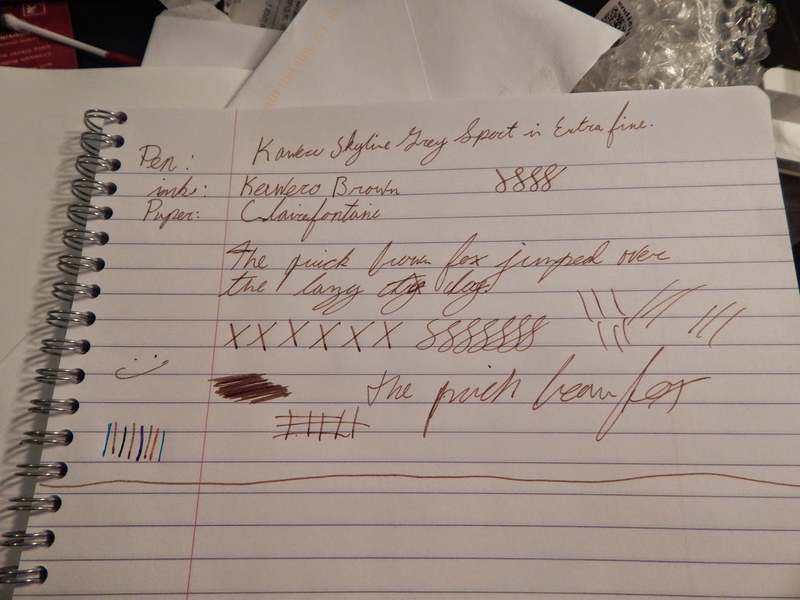
When it comes to nibs I am pretty standard guy, I like a wet medium. But I have always appreciated nibs on the extremes. So this EF nib stood out to me. It does a good job of keeping a nice tight line, that is pretty fine, and has a little spring to it (this does not mean go flexing away with this pen, just that it is responsive). I didn't get any skipping in any direction, even with fast righting. The nib is about as smooth as one can expect such a fine nib to be, and I was actually impressed with it's smoothness. It is by no means a wet writer, but I think put down a generous enough amount of ink for it's width. I would suggest sticking with darker and more saturated colors in this pen because I feel like this pen needs a dark ink to truly shine. All in all I love the pen and I would highly suggest one to others. Being such a portable and EDC type of pen the Sport is, I find it fitting that this pen has such a good EDC nib that this EF can be. With the right kind of ink you will never have to worry about writing on cheap paper again. EF nibs are not really my thing, but I would happily make an exception for this pen.
Since I already reviewed over all fit and finish of this pen over here I am only going to go over how I feel about the nib in this review.
When it comes to nibs I am pretty standard guy, I like a wet medium. But I have always appreciated nibs on the extremes. So this EF nib stood out to me. It does a good job of keeping a nice tight line, that is pretty fine, and has a little spring to it (this does not mean go flexing away with this pen, just that it is responsive). I didn't get any skipping in any direction, even with fast righting. The nib is about as smooth as one can expect such a fine nib to be, and I was actually impressed with it's smoothness. It is by no means a wet writer, but I think put down a generous enough amount of ink for it's width. I would suggest sticking with darker and more saturated colors in this pen because I feel like this pen needs a dark ink to truly shine. All in all I love the pen and I would highly suggest one to others. Being such a portable and EDC type of pen the Sport is, I find it fitting that this pen has such a good EDC nib that this EF can be. With the right kind of ink you will never have to worry about writing on cheap paper again. EF nibs are not really my thing, but I would happily make an exception for this pen.
Sunday, February 8, 2015
Ink-Sane Sunday #3 Diamine Autumn Oak
I got into fountain pens last September. My first purchase was a 4.5 oz bottle of Noodler's X-Feather when a free Preppy included. I loved them both, but after about 3 weeks I lost my Preppy, and still have yet to find it to this day, so I knew I needed an upgrade. I figured a Pilot Metropolitan would do, it seemed like it gave the most "bang for your buck." I was also a little tired of using the same black ink every day, and since Fall was just kicking off and I was in the Autumn state of mind, I bought Diamine Autumn Oak. Here are my thoughts on that same ink in the same pen almost 5 months later.
I very rarely ever grab for this color, as my ink collection has grown I just not longer find myself using the ink. I find that it is a pretty slow drier, yet the ink has a pretty dry flow (trust me I don't understand it either). It has a pretty color, but I find that the "normal" part of the writing (not the super shaded darker section) is far too peach colored for my everyday use. All other attributes are seemingly what you would expect from this sort of ink. If I had to do it over I would most likely have gotten Apache Sunset or some other super shading orange ink, but this one will hold a special place in my heart as the first non-black bottle I ever bought.
Sunday, February 1, 2015
Ink-sane Sunday #2 Noodler's Operation Overlord Orange
I have a special place in my heart for orange. I find it to be on the prettier end of the spectrum when it comes to colors. i have been looking for the perfect shade of orange for a few weeks now, and while this one definitely not perfect, Overlord Orange fits the bill well. As always no issues on the paper, only complaint is that I wish flow was a little better (but to be honest that is probably the pens fault). I would say this is a lot like a calmed down version of Diamine Autumn Oak, the color is the same but no where close the same amount of shading. I love the ink and I would suggest it to others.
Subscribe to:
Posts (Atom)