Sunday, March 15, 2015

Kaweco Sport Classic BB Review

I have already review the body of the sport classic, and you can find that here. Now onto this BB nib!


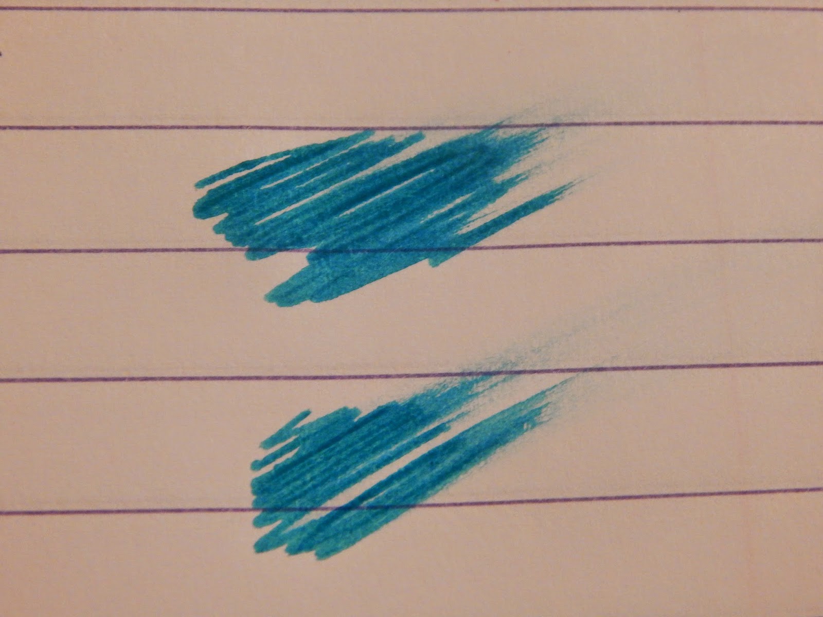
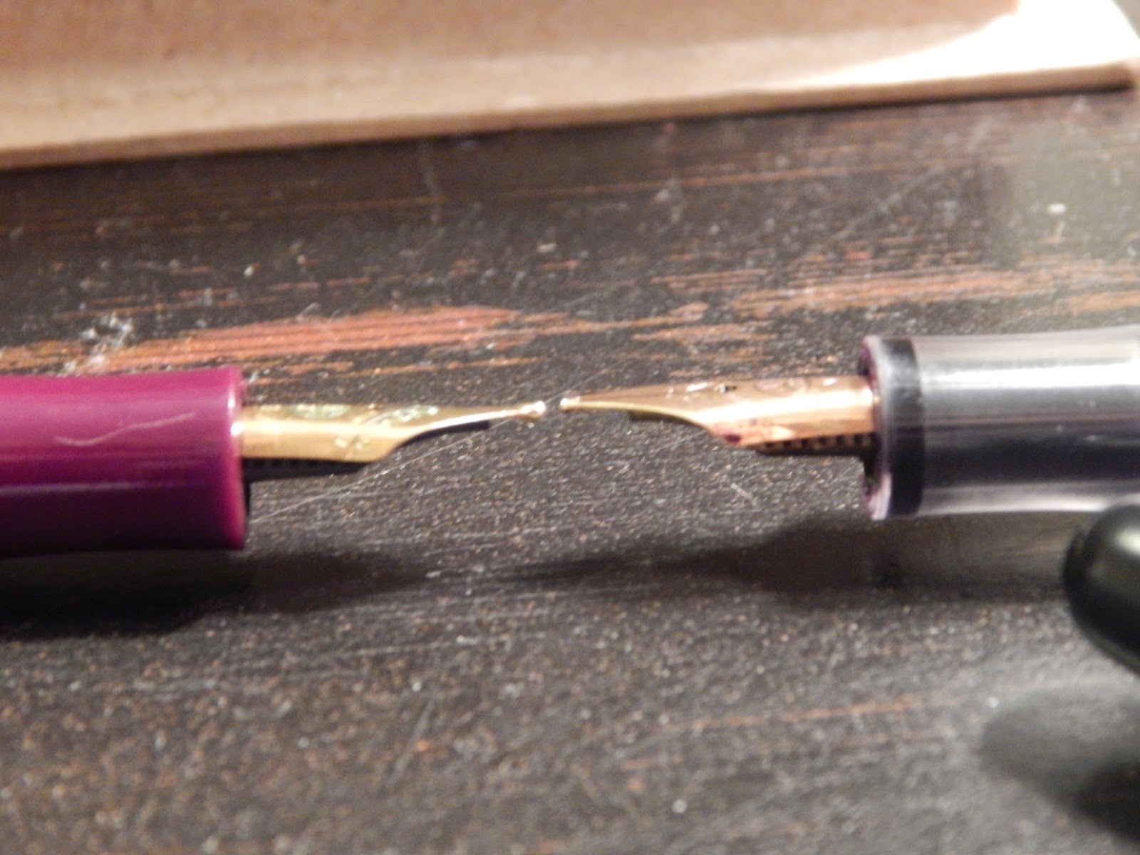
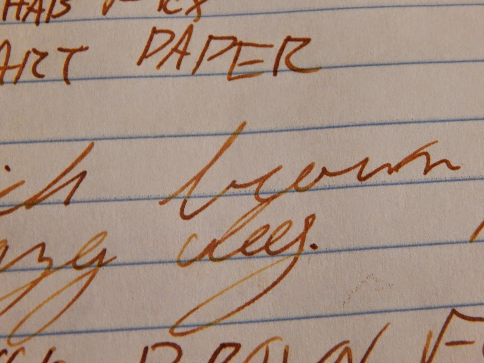
So I was really excited about getting into some special nibs, and straying the norm of medium and fine (which is all I had used before the Kaweco shipment). This nib is not what I was expecting. It is not a very wide line at all, it is just slightly larger than medium sport that is my EDC. I feel like this is mainly contributed by how dry this pen is. It barely puts down any ink at all, which is the opposite of what a BB should do. Because of that there is hard start issues, they aren't bad at all, but they are there.  The nib has some flow issues, but it extremely smooth. This makes me feel like it has a case of "babies bottoms" (essentially over polishing the nib obstructing flow). If this pen was a wetter, I would most likely be in love. Oh well, can always send it off to get it wetter! I'll give it a 5/10 but if it was wetter I would say 8/10 easily. Here are the pictures!


Kaweco Ruby Red Review

Since I am a student I am not much for red inks. Teachers usually don't like it when you use the color they use to mark up test. But I really like this red ink. The best thing to relate it to is a lipstick; not blood-red, but a pink that had enough red in it to be called red. I really like it, and love how wet it is in my Jinaho. Definitely would suggest it to someone who likes a bright red ink. Pics are up next!


Kaweco Paradise Blue Review

Sometimes ink companies get the name of their ink wrong. Such as Montverde Purple, which is actually a bright pink. I personally feel like Kaweco made an error in the naming of Paradise Blue. This ink does not invoke thoughts of sitting on a beach and staring out into a bright blue ocean, which I feel like is what Kaweco is going for. Instead this ink immediately made me think of winter and ice. I think "Icy Blue" would have made an awesome name for this ink, but that even if the name may be off that doesn't effect the attributes of the ink. The icy blue that this ink is isn't really for me, I much prefer richer blues. Although I don't much love the color, all other attributes seem to be very good. I like this ink, but I wouldn't say I love it. If you like this color than I would highly suggest the ink, but if the winter blue isn't for you then I would stay away. On to the pics!


Thursday, March 12, 2015

Noodler's Apache Sunset Review

I'm gonna preface this by saying that I was slightly disappointed by Apache Sunset. I was expecting it to be this crazy high shading ink, with almost unreasonable amounts of color variation. This was not the case; it wasn't even the highest shader in the package I got. Regardless, I really like the ink, and I will probably end up with a bottle of it soon. If you like orange (like you really have to like it), and like a pretty good bit of shading then this ink is good for you. But, I would strongly suggest against this ink if you don't like orange, or are only getting it for it's "massive" shading capabilities. Enjoy the pictures!


Wednesday, March 11, 2015

Noodler's Golden Brown Ink Review

I figured the next logical move for my fountain pen hobby was to delve into flex pen, which will most likely turn into a very expensive move. With my Ahab, I figured I should get some super shading inks as well. The first up for review is Noodler's Golden Brown. I love brown inks, but usually much darker than this. This is now one of my favorite inks, the shading goes from a yellow to a walnut colored brown (which I would actually say is more drastic than Apache Sunset). The only complaint is that is smudges quite easily, other than that it is awesome!